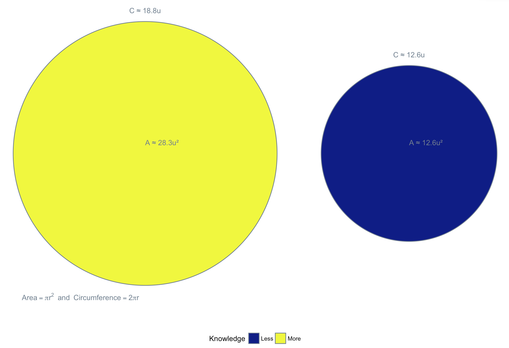
“As the area of our knowledge increases, so too, does the perimeter of our ignorance” — Neil DeGrasse Tyson
One of the many quotables from one of the great science communicators. A key reason in selecting this quote is due to its graphical representation.
The visualization above shows how increasing area (\(A\)) leads to an increase in perimeter (\(C\)) by virtue of the increase in radius (\(r\)) which is the key component of both equations.
NB: Some who are particularly astute (or anal) might correctly highlight that paralleling ignorance to “perimeter” is slightly incorrect: it’s the area of the surrounding space - exclusive of the circle - that represents ignorance, and this area certainly decreases as the circle gets bigger .. but nobody likes a keener
Here’s the R code to create the visualization above using ggplot2, ggforce (for an easy circle geom), and viridis for colour pallette:
library("ggplot2")
library("ggforce")
library("viridis")

#data.frame that provides all the requisite data for plotting
circle <- data.frame(x = c(1, 7),
                     y = rep(2, 2),
                     r = c(3, 2),
                     type = ordered(c("More", "Less")))
#adding `area` (A) and `circumference` (C)
circle <- circle %>%
        mutate(A = round(pi * (circle$r)^2, 1),
               C = round(2 * pi * (circle$r), 1))

#the vis
ggplot(data = circle) +
        # the plot
        geom_circle(aes(x0 = x, y0 = y, r = r, fill = type),
                    colour = "slategrey") +
        annotate("text", x = circle$x, y = circle$y + 0.25,
                 label = paste0("A ≈ ", circle$A, "u²"),
                 hjust = 0,
                 colour = "slategrey") +
        annotate("text", x = circle$x, y = circle$y + circle$r + 0.25,
                 label = paste0("C ≈ ", circle$C, "u"),
                 colour = "slategrey") +
        annotate("text", x = -1.8, y = -1.25,
                 label = "Area==pi*r^2~~and~~Circumference==2*pi*r",
                 parse = T,
                 hjust = 0,
                 colour = "slategrey") +
        # a colour pallette from viridis
        scale_fill_viridis(discrete = T, option = "C") +
        coord_fixed() +
        # vis labels
        labs(x = "", y = "", fill = "Knowledge") +
        theme_bw() +
        theme(legend.position = "bottom",
              axis.text = element_blank(),
              axis.ticks = element_blank(),
              panel.grid = element_blank(),
              plot.background = element_blank(),
              panel.border = element_blank())